|
| |
| |
|
| |
| |
| Client: Tandem Design |
| Scope: Promotional Mailer |
| |
| |
| Tandem Design – Design is not Pretty |
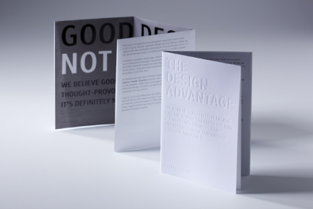
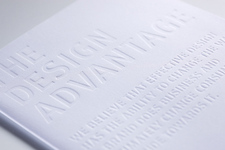
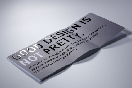
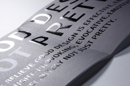
| Tandem Design’s launch marketing material adopted a sophisticated
typographic approach using copy to challenge readers notion of how
they viewed design. The graphic typography treatment was enhanced
with the use of blind embossing and foil stamping print finishes. The
overall effect is one that reflects the founders design philosophy of
“Simple, but not bland”. |
| |
Second Prize in Print – Direct Mail, International Design Awards
Download News Release |
| |
|
| |
|
